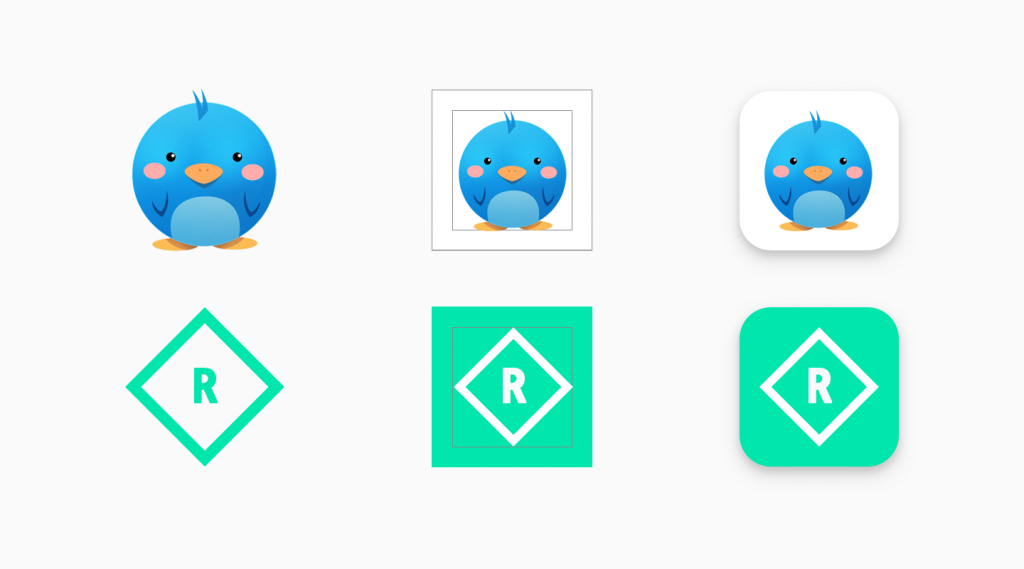
After updating several developers’ policy, now play store recently introduced Google Play Store Game and App Icon Design New Policy in which they have clearly mentioned the design and specification of games and apps icon.
From beginning to now, we have seen that Google Play Store is updating its policies time by time for better user experience and to prevent spams. From past 2 years, they have introducing several new terms and policies and now they have introduced new policy about play store app and game app icon specification.
Google Play Store Game and App Icon Design New Policy
Purpose of play store app and game icon design new policy is to ensure the uniformity and gives the consistent look in Play Store. They have done it with all games and apps icon designs for better showcase your games and apps icons in same and high quality design and for better user experience.
Well, may be lot of developers will unhappy with this new policy update of app and game icon specification because there are lot of apps and games who have designed their icon with different styles including transparent backgrounds to give a stunning look to their icons.
Google Play Store Game and App Icon Design New Policy prevents all such developers to remove and not use transparent background in their apps and games icon. They have clearly described it in their new policy of android app and game icons that no more transparent background is accepted. They have also guide users with complete tutorial about how to update and make icons from now to not violate this new policy of Google Play Store.
New Specification of Play Store App and Game Icon
It is important to follow this new policy about app and game icon because from May 1, Google Play Store will no longer accept app/game icons that don’t meet the standards of this policy. If you don’t update your app icons till June 24, Google Play Store will auto convert all icons to legacy ones.
So, what are new specification of Google Play Store Game and App Icon Policy? They said in the icon specification guide that adjust targeted part of your icon within a square of 512×512 icon. It is important to leave 20% radios around your targeted icon design to the corner of icon. Play Store will auto adjust the corners with rounded mask and shadow to ensure the consistency of all games and apps icon as image below:

There is no any effect on the icons of your app’s drawer. They are doing this to make sure that it is easier for developers to get adaptive icon in their launcher. Moreover, it will help to enforce uniformity in Google Play Store for better user experience.

